Brand identity for an organic foods startup
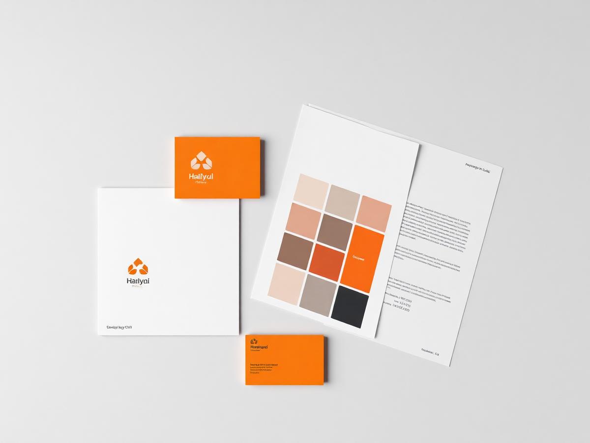
A complete identity system — logo, palette, typography and guidelines — for a new organic grains brand entering retail.
- Client
- Haryali Organics
- Industry
- FMCG / Organic Foods
- Year
- 2025
Overview
Haryali Organics needed to look established from day one to secure shelf space with regional retailers.
We developed a warm, confident identity that works equally on packaging, signage and a phone screen.
The challenge
Standing out in a category crowded with green-and-leaf clichés, while keeping print costs realistic for early-stage packaging runs.
Objectives
- Create a distinctive, ownable mark
- Build a palette that prints affordably
- Deliver full brand guidelines for future vendors
- Design launch packaging and stationery
Our solution
- Three distinct logo directions presented in real packaging contexts.
- A warm earth-and-orange palette with exact print and screen values.
- A type hierarchy pairing a confident display face with a highly legible body face.
- A guidelines document covering clear space, minimum size and misuse.
How the project ran
Discovery
Positioning workshop, competitor shelf audit and audience definition.
Concepts
Three original directions with distinct personalities, each shown on pack.
Refinement
Two revision rounds on the chosen mark, tested at small sizes and single colour.
Handover
All vector and raster formats, colour references, fonts and a guidelines PDF.
A closer look

What changed for the client
- Retail partners at launch
- 12Retail partners at launch
- Weeks to full handover
- 3Weeks to full handover
- Asset ownership transferred
- 100%Asset ownership transferred
Retailers took us seriously immediately. The identity made a brand-new company look like it had been around for years.

Let's grow your business
Book your free consultation today. We'll review your current presence and tell you exactly where the next enquiries will come from.